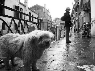
I found similar images what we've shot for assignments, and those we've viewed. Each of these interested me because of the contrast and use of light, movement or depth of field.
They are basic photos from blogs that I looked at that consider form and content.
1. Fiat 500 Black and White Italy
Post by Euroflash on DeviantArt
First Impressions-The perspective of the shot of this car drew my attention. The relection of the surrounding building and the deep blacks on the bottom third of the picture ground the subject. The light around the car also creates a glowing feeling.
2. Put the Camera Down and Feed Me
Taken by Yulia Rodnina, Post by A Photo a Day from Planet Earth on WordPress
First Impressions-The content drew me to this image. The subject and setting in Venice create a romantic mood. You wonder who the person is, and who the dog actually belongs to. The technical format with perspective and depth of field prompt me to ask more questions. What is the dog feeling/doing? Does the title give it away?
3. Pursed
Taken by Yulia Rodnina, Post by A Photo a Day from Planet Earth on WordPress
First Impressions-What a portrait. The movement in the background caused me to take another look and consider what the subjects are doing. Where are they? What time of day is it? It's a questionable and mysterious type image. The dark contrast of his clothes make the eye come back to look at him. His placement also seems awkward.
After looking at these pieces I had to recognize all that goes into understanding and evaluating an image. I came up with several questions. How does the title make a difference? How many format details were successful? What is the general feeling? Also, what kind of attachment does the viewer make to various images? Is it similar to what Roland Barthes suggested? Do I read into the form and content?


